Lady bikes inside a store to power a cute conveyor belt, for a Valentine’s gift: Branded video by my favorite notebook brand

Branded video by Muji.

Nice marketing (probably targeted towards current brand-lovers, like me).  So consistent with their brand personality: warm, crafty, with a clean, simple aesthetic.
Aaaand subtly highlights their product range. In a 4 and a half minute video.

Make MUJI.

via popbee.com

5 Ideas I liked (since January): Pie + Creative brainstorming, Google work philosophy, Watercolor Typography, Facebook Userflow

1. One of my favorite ideas in the past year.

Pie + User Feedback or Community Involvement + Design = PieLab

2.  This PaidContent article on the insensitive coincidences of online ads and tragic news stories (e.g. shooting massacre articles and bloody novelty shirt ads).

Screencap by Evan Brown

3.  “Why Google Does Things The Way It Does“, by The Guardian.

Thought-provoking.  Because you keep hearing about how Google is revolutionary, but they’re never as suave at branding themselves as Apple, plus they have weird ideas like Google glass, and annoying decisions like killing Google Reader:

“In its behaviour and vocabulary, Google oozes scientific method. A couple of times recently I’ve heard Google executives say in public, ‘if you can’t measure it, you can’t improve it’. …engineers are trained not to act on intuition. You are allowed to have intuition, of course, but you use it to make hypotheses, which you then test. You act on the results of those tests…

When an experiment is completed, you either choose to follow up on it, or you terminate it and move on to something else. A scientist doesn’t get emotional about this; it’s the way the system works, and everyone knows that it’s all for the best.”

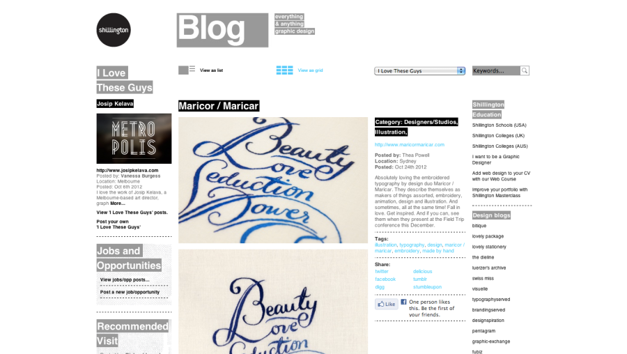
4.  I don’t know which I enjoyed more – the Maricor/Maricar watercolor typography exercises…

Or the Shillington Design Blog “I Love These Guys” category page, where they were featured?

Shillington Design Blog - MaricorMaricar
Shillington Design Blog – MaricorMaricar

5.  Facebook sharing its “Report Abuse” interaction flow.

Fast Company 100 Most Creative People 2012: I’m impressed.

I know I am such a fan girl, even of the hard-copy-physical-media magazine.

But, I think this is how a text-rich magazine is translated smartly to web.
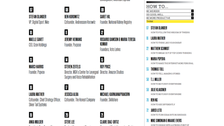
It retains the strengths of a text content-rich magazine, plus the way they structured the information, and how to navigate through it, is just practical.

It prepares for and takes advantage of the strengths of web.

On paper or print, a large part of the ease is just being able to randomly flip-through.

I just realized now that I can go through and enjoy an entire magazine without even reading the table of contents.

Not the same for a web experience – people won’t click on things that they don’t feel will have something interesting “behind” it.

Now, that makes it hard because that means every single piece of content you have has to have an enticing way of being found.

Be it through a text link, an engaging image or a meaningful description.

But, what the web has, that print doesn’t, is adaptability (according to your personal taste).  It can allow you to explore a single set of information using multiple systems of navigation – going through something the way you’d find interesting.

And, that’s what Fast Company did for their 100 Most Creative People in Business 2012 issue.

The design team for the feature, who I’d like to name and laud if I could (I’ll try to find them), decided to have two ways of wading through the content.

You can either go through:

1) a countdown-type, names-in-order of “creativity” list (similar to the magazine),

2) or through a skill-centered path, where you go through the articles according to what advice or skill sets you want to work on.

The skill-groups are cute, too:

Be Weirder

Do Good, Well

Be More Productive

Think

Rethink

Sell

Lead

See, relevant and concise.

The entries themselves also follow the little guidelines I see on the usability sites, and they help.

Bulleted lists, highlighted text, one-paragraph nuggets of content; relevant hyperlinks.

If they had used the exact same format from the magazine, it would have been so much harder and less interesting to go through.

I think I actually like the information architecture more than the list itself haha.  I shall just leave a comment on their page. Yay, Fast Company!

[Sorry for the really long image, I screengrabbed the entire page.]

Teenage Engineering: The group that helped Ikea make a digicam out of cardboard

Ohmilawrd.  This site deserves its own entry.

Teenage Engineering was mentioned in the articles for IKEA KNÄPPA, the cheapest digital camera created, crafted from cardboard, featured on petapixel.

Teenage Engineering worked with Ikea on the camera, and with a name like that, I had to check out their site (wrong pronoun placement/use of antecedents).

I have to post their “About Us”-slash-“Careers” page.  I would like to work for a place that thinks of pages like this (but that’s just the fangirl in me talking):

The Stockholm agency’s current main product is a digital synthesizer and this is their product feature page:

That’s really all.  I just really wanted to show their site off. Haha nice clean, but colorfully loud aesthetic, highlighting their products.

P.S. While, I’m at it – this PS AT HOME site by Ikea, also a great idea.

Featuring their products in actual people’s homes.  Good strategy.

Innovative Social Media Apps: Let’s make things simpler, tangible and more relevant, shall we?

Ideating in this day and age calls for a whole other set of creativity.

I want to bookmark some of the most relevant (to me) tweaks and ideas that people thought up to harness the stream of social media…stuff.

Responses to oversharing.  No one can deny that individuals with thriving online lives experience lots of clutter.
Every day, it’s entry after entry, stream upon stream of individuals, groups, organizations sending you virtual updates.

So what can we do about it?

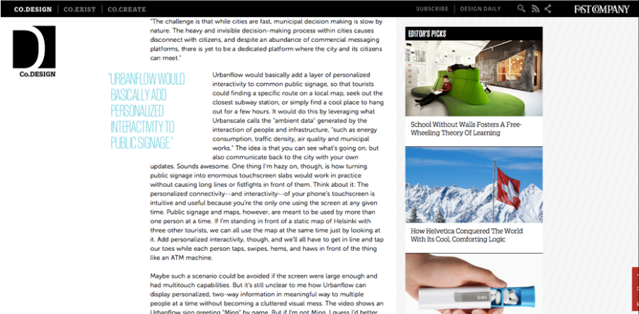
1. To combat the overall bombardment, Flavors.me, featured in Fast Company, collects and streamlines your different social feeds into one “page”.  Fast Company writes that it’s similar to About.me, but I’m just generally happy that there are ideas like these that are trying to corral the onslaught.

2.  But then, we also have Shu.ush, which works only within Twitter, featured on Co. Design.  I love how it literally “tones down” the din from talkative tweeters.  Just really amusing.

We’ve also got innovation ideas that make the digital Instagram stream more tangible.

3.  Printstagram takes your Instagram pictures and turns them into stickers.  via PetaPixel

Similarly, you also have Instaprint by Breakfast NYC, which is an installation or a physical photo booth that prints Instagram photos too.  Featured by Creative Applications.

How about letting someone’s Instagram stream give you travel guidance?  Enter Wander.  Featured on PetaPixel.

I think this surprisingly makes sense, since iPhone or Apple product owners would probably frequent places of interest for global counterparts with similar purchasing power.

Damn, I talk in a really boring way now.  Mental laziness.

4.  Also, to make things easier to grasp for the Pinterest generation, Brazilian agency ionz creates infographics out of users’ personal informaton (likes, dislikes, favorites) to create your “digital persona” desktop wallpaper.  Fun idea. via Creative Applications

And lastly, for people who just want to keep their finds to themselves:

5.  Pinry.  via The Next Web

For the people who really just want to collect stuff, without sharing.

Isn’t that great – they even have apps for selfish, hoarding people! Like me!

Fangirl mode: the barbarian group

I came across the barbarian group through an article one of their co-founders wrote an article on the vulnerability of the social media giants on Beta Beat.

I’ll be watching out for their work.  They seem to be the first massive purely digital agency I’ve seen.  The others usually seem to be under multinational umbrella agencies who started in traditional media.

I also like the navigation set-up of their portfolio – which has a secondary navigation bar showcasing: new projects, case studies, featured projects, greatest hits, lab projects and a client list.

They just made it simple to find things, with clear paths.  Which is just right considering they’re in the business of interaction design.

They have an interesting blog – which both showcases their work, but also reports relevant industry-wide updates.  I found this nice article on managing “content creep” – the social media content strategy of version of feature creep.

Besides that, they have amusing personal (okay, that’s not the right word) projects like Is Pinterest the next ____? , which is their way of poking fun at all the Pinterest hullaballoo.  Although, aside from fun projects like that and a screensaver made of your friends’ Instagram feeds, they have innovation projects like a digital mirror.

5 Favorite Finds: Wendy MacNaughton, Zeldman blog, The Atlantic Cities, Emily Badger, Citizens for Optimism

I am floored by people’s amazing brains.

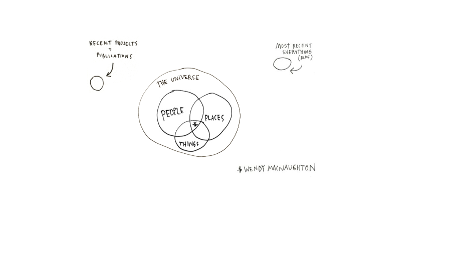
1.  Via The Littlest Comma, I found my way to Wendy MacNaughton’s blog and illustrations.  I am definitely going to buy one of her pieces from 20×200.

She’s clever, and her illustrations are accurate, but quirkily fun.

2.  The Zeldman site, by Jeffrey Zeldman, A List Apart‘s main man and founder of Happy Cog.

He recently featured notes from An Event Apart, as taken by Luke Wroblewski: on Kim Goodwin’s Silo-Busting with Scenarios, Zeldman’s Content First, and Whitney Hess’s What’s Your Problem?

3.  The Atlantic Cities

"Subway Platforms Around The World"

I like how they have a special (and engaging) section on Neighborhoods and urban planning.  It’s such a content- and category-rich site :O

Yes, that was an emoticon.  I can’t express how amazed I am at the sections they thought of.

Like “The Democracy in America” section!  Where they have a This Week in Bans feature!

Why I find this cool – this week’s feature, for example, on parents in New York’s Park Slope trying to express how they want ice cream vendors to be banned from the park is a genius example of freedom of speech. Particularly, this one line from a comment stream, that just shows the interplay of different economic forces at work: “I should not have to fight with my children every warm day on the playground just so someone can make a living!”

Other articles I bookmarked were: The Map Geeks Behind “Bostonography” and America’s Urban-Rural Work Divide (which I want to use as inspiration when categorizing occupations).

4.  Emily Badger, whose articles I found in The Atlantic Cities.

I like the way she writes, and what she writes about.  She writes about cultural trends regarding architecture and urban spaces, but in a relatable and un-hoighty-toighty way, like in I Can’t Stop Looking at Photos of Absurdly Tiny Homes.

5.  Citizens For Optimism, a group of designers who created posters based on words that a survey of New Yorkers associated with “optimism”.

Joe Hollier - "Sing"
Pablo Delkan - "Dream"

Fast Company Redesign: Making me, uncharacteristically, favor digital over print

Lo and behold, Fast Co. got a nice new facelift and punched up their digital brand extensions!

*Forgive me, I first started writing this post on February 01, 2012, but I didn’t get around to posting until now.  So this is severely outdated.

I haven’t even checked out the Fast Company site in quite a while; but the article link from my Facebook feed seemed interesting.

To my surprise, this page opened in my browser:

I can’t even fully remember what it looked like before, which slightly frustrates me since it would have been great to compare them side by side.  But, even without an actual copy of the old design, this current one just seemed much cleaner, and immersive.

The page also contained a link to the strategy behind the redesign.

My liking for the comments section was sparked by that redesign article.  I liked how they were thoughtful about users’ feeling that they were part of the content – using sophisticated type and a sizable font to showcase the comments.  Smart smart smart.  Made me want to see my name in each comment stream.

Kudos to the team, I love how it does feel more like a magazine adapted to the digital age.  There’s a splashy cover photo, clean, smart fonts, and I like the subdued pinstripe  underneath the sidebar.

I aso like the execution of the “social layer” – with the links being “called up” only when you hover over the smartly designed Share, Like and Tweet counters, and the fixed header once you scroll past the first fold!

4 Things I loved on the web today: The Amazings, Austin Kleon, excerpt from Jay-Z’s Decoded

1. The Amazings.

via Co.Exist

This idea is amazing.  Mutually-beneficial.  Makes best use of the wisdom and hard-earned skills of the earlier generations.

Beautiful accompanying imagery in the Co.Exist article.  This is what I call a “magazine experience” on the web.

by lebanMax on Shutterstock

2.  The evolution of education.

Co.Exist featured excerpts from Jay-Z’s Decoded, on urban youth and the drug game (with insightful writing and analysis by Nathaniel Wittemore).  What he said, I feel, goes hand-in-hand with the Vijay Vaitheeswaran interview about bottom-up innovation (also from Co.Exist).  Vaitheeswaran is a correspondent for The Economist, and an adviser on the World Economic Forum.

“There’s no dream in fast food. Manager? That’s a promotion, not a dream. It took me a long time to realize how much courage it took to work at McDonald’s. … But at that time, it seemed like an act of surrender to a world that hated us.”Jay-Z

“The current education system that our and other countries developed was suited to the industrial revolution, a one-size-fits-all model for education that treats people as commodities. But we’re in an innovation age where creativity, individual initiative, willingness to think out of the box and disrupt established business or even lifestyle patterns is much more important than simple manual tasks that produce the next widget…

…If they don’t reinvent their business models to be more frugal and cutting edge in terms of technology and customer needs, guess what? The Chinese, Indians, and Brazilians are going to do it and they’re going to do it cheaper and maybe even better.” – Vijay Vaitheeswaran

3. Sensuous design from Adele Rotella.

I love her portfolio.  The pieces are well thought-out – spare, but emotive.

Sciocola - Adele Rotella
Tavi - Adele Rotella

4. Cool minds like Austin Kleon‘s.