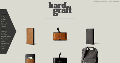
1. The Verge 2. hardgraft 3. Remedy Quarterly’s remedy page 4. Nike’s delineation of its consumer and business sites 5. Foodspotting 6. FontShop’s Education page 7. An extra item for digital marketing strategy: Thought Catalog’s smart ad opportunity (Levi’s).
And, in an upcoming post, the redesign of Fast Company’s family of sites.
1. Oh, Verge. You make my heart swoon. With your overall clean-ness, the mannish triangle that appears on the topmost righthand corner once you start scrolling down, the way that the drop-down menu contents change as you scroll through the product/sub-heading names, the shape of the Next and Previous arrows.
And, most of all, the execution of the floating and clickable category header lightbox which follows the reader through the article.
I actually enjoy your inner pages, much more than your homepage, though. Your front door, though still snazzy, seems a bit..crazy or hectic once you starting moving down.
2. I love this site. Clean, but warm. Populated solely by necessary content that’s well-organized. Ugh, hard graft, smart.
The rest after the jump.
Continue reading “Semi-work: 7 bits of Web design inspiration”


